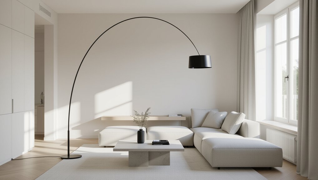
You create clean interior lines by setting clear minimalist priorities, then mapping circulation so major furniture stays on the perimeter and sightlines stay open. You cut visual noise by limiting accessories, tightening the palette to one neutral, one midtone, and a restrained accent, and standardizing undertones and sheen. You choose crisp, low-profile pieces with consistent radii, and you hide clutter in flush, full-height storage with tight shadow gaps. Layer dimmable, high-CRI lighting to sharpen planes; keep going for finer alignment tricks.
Key Takeaways
- Define minimalist priorities (flow, low maintenance, negative space) and set measurable limits for floor clearance, surface coverage, and accessories.
- Plan layout around clear circulation paths, align furniture to room axes, and keep the center plane open for uninterrupted sightlines.
- Choose geometric, low-profile furniture with crisp edges and consistent proportions to maintain clean lines and reduce visual bulk.
- Tighten the palette to one neutral, one midtone, and a restrained accent, keeping undertones and sheens consistent across adjacent surfaces.
- Integrate flush, full-height storage with concealed hardware and aligned seams to hide clutter and preserve smooth wall planes.
Define Your Minimalist Living Space Priorities
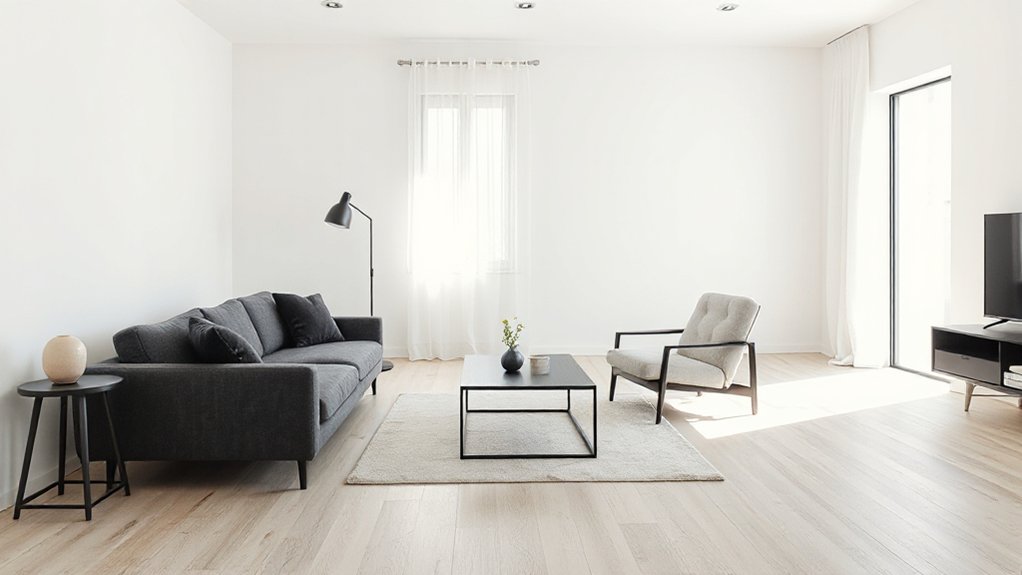
Before you buy a single storage bin or repaint a wall, define what “minimal” needs to do for you: reduce visual noise, improve flow, simplify maintenance, or highlight a few high-quality pieces. Translate that goal into measurable criteria: target clear floor area, limit surface coverage, and specify a color temperature and beam spread for artificial lighting. Decide where you’ll accept contrast—matte versus satin, warm oak versus cool stone—so clean lines read intentional, not sterile. Set a ceiling on decorative accessories by function and silhouette: one sculptural object per zone, or none on work surfaces. Prioritize storage that aligns with wall planes, hides hardware, and preserves negative space. Then you’ll choose edits that support your stated performance brief.
Spot Visual Noise That Breaks Clean Lines
You’ll spot visual noise by mapping clutter hotspots where small objects accumulate and interrupt long sightlines—entry consoles, open shelves, and countertop edges. Next, you’ll evaluate competing patterns by checking how adjacent textiles, grains, and tile repeats collide or create moiré-like tension across planes. Finally, you’ll reduce color distractions by limiting high-chroma accents and tightening the palette so edges read crisp and continuous.
Identify Clutter Hotspots
Although minimalist interiors rely on uninterrupted planes and crisp edges, clutter hotspots introduce “visual noise” that bends clean lines into a scattered silhouette. You’ll spot them where objects pause mid-use: entry consoles, coffee tables, kitchen counters, bathroom vanities, nightstands, and the chair that becomes a staging zone. Scan at eye level and along baseboards; anything protruding past a planar boundary reads as jitter.
Audit surfaces by function: what lands here daily, weekly, rarely? Group items into one move, then measure the footprint each group deserves. Watch for hidden clutter in drawers that won’t close flush, shelves packed past the face frame, and cords that arc off walls. Specify storage solutions with exact volumes—trays, bins, cable channels—so containment stays aligned, squared, and predictable.
Evaluate Competing Patterns
Once you’ve contained the obvious clutter hotspots, competing patterns become the next source of visual noise because they fragment what should read as continuous planes. Audit every repeating motif in your sightlines: rugs, upholstery, throws, wall art, and even grille vents. If two patterns share similar scale but different geometry, the eye can’t resolve hierarchy, and clean lines collapse.
Control Pattern contrast by limiting adjacent surfaces to one dominant pattern and one subordinate texture. Keep pattern scale separated—large on the floor, micro on pillows—so edges stay legible. Check alignment: stripes that fight baseboard lines or grid tiles that don’t register with cabinetry create jitter. Prioritize Texture harmony: pair matte weaves with smooth solids, and avoid stacking coarse textures in the same zone. Re-test from the entry point and seating position.
Reduce Color Distractions
When color contrast spikes in the wrong places, it slices continuous planes into fragments and turns clean interior lines into stop‑start interruptions. You’ll spot this visual noise where small, saturated objects sit against quiet fields: bright throw pillows, loud book spines, high‑chroma art, or glossy packaging on open shelving.
Reduce distractions by compressing your palette: pick one dominant neutral, one supporting midtone, and one restrained accent. Apply color psychology deliberately—cool neutrals extend perceived depth, warm neutrals tighten volume—so planes read continuous. Then standardize undertones across large surfaces (walls, floors, casework) and repeat the accent at consistent heights to maintain visual harmony. Hide micro‑color clutter in closed storage, decant essentials, and matte down reflective finishes that amplify contrast.
Edit What You Own to Restore Clean Lines
To restore clean interior lines, you’ll need to edit what you already own with the same rigor you’d apply to an architectural drawing. Start by sorting items by silhouette: rectilinear, cylindrical, irregular. Keep pieces with crisp geometry and consistent edge profiles; remove anything with fussy contours, bulky bases, or visual noise. Audit surfaces next: each plane should read as intentional, not as storage. Consolidate small objects into a single lidded vessel, and retire duplicates. For Personalizing decor, limit accents to one repeatable material story—wood, blackened steel, or matte ceramic—and enforce it. When Incorporating artwork, choose fewer, larger works with clean mats or thin frames, then align them to existing datum lines like shelf edges or door trims. Store the rest out of sight.
Plan a Minimalist Layout With Open Sightlines
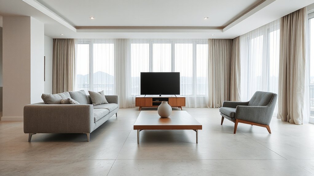
Edited belongings give you clean forms; the layout decides whether those forms read as calm or as clutter. Map primary circulation first: draw a straight path from entry to seating, and keep it unobstructed. Anchor major zones to the room’s longest axis so your sightline runs to a window or blank wall, not to stacked objects. Use space optimization by pushing volume to the perimeter and preserving a clear center plane. In furniture arrangement, align edges to a shared grid; small misalignments create visual noise. Maintain consistent offsets from walls, and keep negative space between pieces so silhouettes stay legible. Treat door swings and drawer clearances as hard constraints, then refine spacing until movement feels effortless.
Choose Streamlined Furniture With Crisp Edges
You’ll reinforce clean interior lines by prioritizing sharp geometric silhouettes—rectilinear frames, tight radii, and crisp reveals that read as intentional edges. Choose low-profile seating with squared arms and slim bases so the visual horizon stays flat and uninterrupted. Favor seamless built-in storage with flush fronts and concealed pulls to keep surfaces planar and joints visually quiet.
Prioritize Sharp Geometric Silhouettes
While a minimalist palette calms the room, sharp geometric silhouettes give it structure and visual discipline. You’ll get that clarity by selecting furniture with crisp edges, squared profiles, and consistent radii, so every piece reads intentional from multiple viewpoints. Favor rectilinear tables, box-frame consoles, and planar shelving that emphasize sharp angles without ornate progression. Control visual noise by repeating geometric patterns subtly—think aligned grid seams, linear pulls, or panel reveals that echo the room’s architecture. Keep proportions tight: thin tops with strong perimeter lines, legs set flush to corners, and uniform shadow gaps beneath surfaces. Specify matte lacquer, powder-coated steel, or sealed wood with straight grain to reinforce clean intersections. When you place pieces, align edges to wall lines and maintain parallel spacing for a precise layout.
Select Low-Profile Seating
Where does a minimalist room feel most visually “heavy”? It’s usually at seating height, where bulky frames interrupt sightlines. Choose low profile seating to drop the horizon line and keep wall planes reading continuous. Look for crisp edges, tight radii, and rectilinear cushions that align with your room’s dominant geometry. Favor exposed plinth bases or thin metal sled legs so the volume appears to float, and keep armrests slim to reduce lateral mass. Maintain consistent seat depths across pieces to preserve a clean grid.
Specify subtle upholstery in matte weaves, bouclé with minimal pile, or tightly tailored leather with concealed seams. Keep stitching linear, avoid piping, and choose neutral, low-contrast tones to prevent visual noise.
Favor Seamless Built-In Storage
If you want wall planes to read as uninterrupted surfaces, integrate storage into the architecture instead of scattering casegoods across the floor. Specify seamless cabinetry that aligns with door heads, window mullions, and ceiling datums, so every reveal feels intentional. Use full-height panels, push-latch hardware, and tight 2–3 mm shadow gaps to keep edges crisp and readable.
Place integrated shelving in niches and between studs to preserve circulation and reduce protrusions. Keep depths consistent—typically 250–300 mm for books, 450–600 mm for media—so elevations stay flat. Match finishes to wall paint or use low-sheen veneer with continuous grain for visual calm. Conceal baseboards behind toe-kicks, and run LED strips in concealed channels to float planes without clutter.
Hide Clutter With Minimalist Storage That Aligns
Because clean interior lines rely on uninterrupted sightlines, you’ll want storage that conceals everyday clutter without introducing visual noise. Choose low-profile units that align to architectural datums—baseboards, window mullions, and door reveals—so edges read as intentional continuations, not add-ons. Use Hidden storage behind flush fronts: push-latch doors, finger pulls routed into edges, or recessed toe-kicks that eliminate protruding hardware. Keep modules dimensioned to common objects so contents don’t force bulging baskets or stacked overflow. Integrate decorative compartments sparingly: a single shadow-gap niche for one object, or a lidded tray that docks perfectly within a shelf bay. Maintain consistent panel thickness, tight tolerances, and even gaps to preserve the calm, linear field.
Use a Calm Minimalist Color Palette
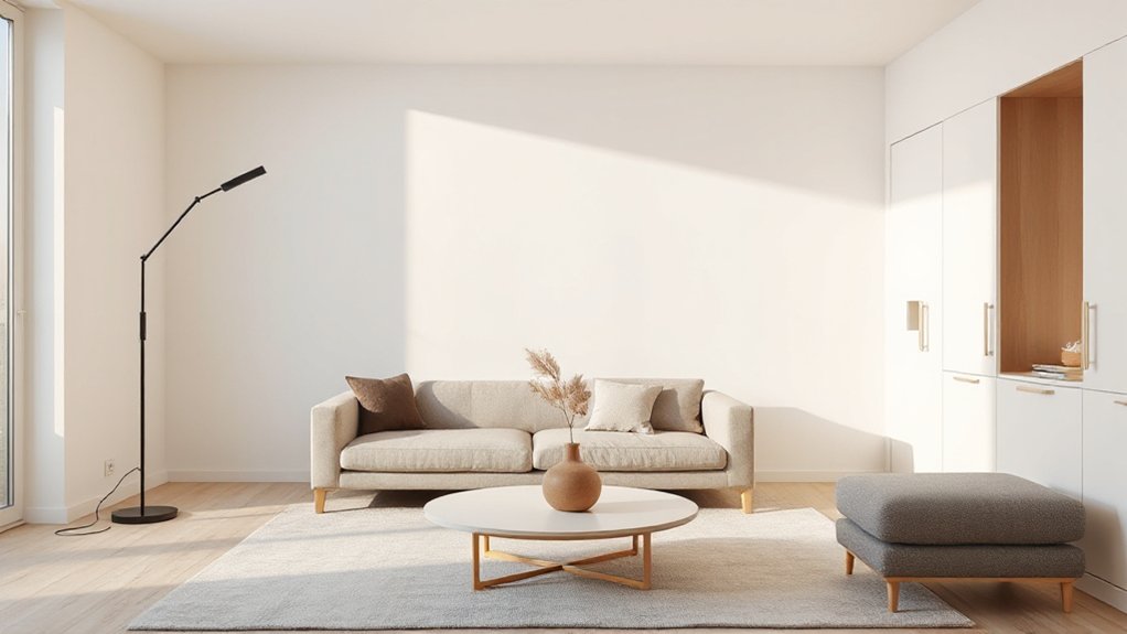
Although minimalist interiors can handle contrast, you’ll get the cleanest read by locking in a restrained palette—one warm or cool neutral as the field color, a second tone for quiet depth, and a single accent held to a low saturation. Build Color harmony by keeping undertones consistent: pair yellow-based whites with greige, or blue-based whites with cool gray. Control palette contrast through value spacing, not extra hues; aim for a 60/30/10 split and keep the accent within two steps of your midtone on a value scale. Sample large swatches under day and night lighting, then commit to uniform sheen across adjacent planes to prevent edge noise. Use crisp trim-to-wall relationships to sharpen lines without adding color clutter.
Choose Warm Minimal Materials (Matte, Wood, Linen)
You’ll keep clean interior lines crisp by specifying matte finishes that cut glare and visually soften hard edges. You’ll introduce warmth with controlled wood-grain accents—think straight grain, low-contrast tone, and minimal joinery that reads as one continuous plane. You’ll finish the envelope with linen textiles that add tactile comfort and subtle texture without breaking the minimalist profile.
Matte Finishes That Soften
When crisp interior lines start to feel too clinical, matte finishes restore balance by diffusing glare and lowering visual noise without breaking the minimalist profile. You’ll notice edges read cleaner because light falls evenly, so junctions, reveals, and shadow gaps look intentional rather than harsh. Use low-sheen paint (5–10 GU) on walls and millwork to prevent hotspots near windows and downlights.
Apply matte lacquer or powder-coated metals on handles, frames, and fixtures to keep highlights tight and controlled. Pair these Matte finishes with Soft textures—linen drapery, brushed cotton upholstery, felt pads—so surfaces absorb light and sound instead of reflecting both. Choose micro-textured plaster or clay paint where you want depth without pattern. Keep the palette warm-neutral, and maintain consistent sheen across adjacent planes for seamless continuity.
Warm Wood Grain Accents
Matte surfaces set a calm baseline; warm wood grain adds the natural frequency that keeps clean lines from reading sterile. You’ll get the best effect when you limit species and sheen: pick white oak, walnut, or ash in a low-satin oil, then repeat it across a single plane—base cabinets, a floating shelf, or a slab bench. Keep edges crisp and radii tight so the material reads intentional, not country.
Use grain as a directional tool: run it horizontally to extend walls, or vertically to heighten a niche. Add Rustic accents sparingly—end-grain details, exposed joinery, or a pegged corner—then balance them with Modern contrast like blackened steel, matte stone, or monochrome cabinetry. Control clutter by integrating pulls and aligning seams.
Linen Textiles For Comfort
Although hard planes and tight reveals define minimalist interiors, linen textiles soften the geometry without breaking the clean-line discipline. You’ll get tactile relief without visual noise by selecting plain weaves, tight hems, and restrained seams that read as crisp, continuous fields. Favor Linen textures in midweight, garment-washed yardage; they drape cleanly yet hold a squared edge on cushions and bench pads. Use breathable fabrics for curtains and bedding to regulate humidity and prevent that sealed, echoing feel common in sparse rooms. Specify matte finishes, muted neutrals, and low-contrast stitching so textiles integrate with cabinetry lines and shadow gaps. Keep patterns minimal—subtle slubs only—and repeat the same tone across throws, slipcovers, and pillow inserts for coherence.
Light Clean Interior Lines With Layered Lighting
Because minimalist interiors rely on uninterrupted edges and shadow control, you’ll want layered lighting that clarifies clean lines without adding visual clutter. Start with a dimmable ceiling plane or cove to establish an even ambient glow; keep fixtures flush and finishes matte to avoid specular noise. Add wall-washers or narrow-beam downlights to rake across verticals, sharpening reveals, jambs, and millwork gaps. Then use low-profile task sources—linear under-shelf LEDs, recessed toe-kick strips, or slim floor lamps—to support reading and circulation without breaking sightlines. Specify high-CRI LEDs (90+), 2700–3000K, and tight glare control (UGR-aware optics) so edges read crisp. Program scenes so layered illumination shifts smoothly from day to night.
Decorate Lightly and Keep Clean-Line Habits
Once you’ve established a calm architectural base, you should decorate with a strict edit so the room’s lines stay legible. Practice Light decorating: choose one focal object per sightline, then leave negative space to emphasize junctions, reveals, and straight edges. Keep palettes compressed—two neutrals plus one controlled accent—so shadows describe form instead of pattern noise.
To maintain Minimalist aesthetics, build clean-line habits into daily use. Return items to closed storage immediately, and keep horizontal planes at 80–90% clear to preserve visual flow. Route cables through raceways, align frames to a single datum, and standardize hanger and container colors. Dust with a microfiber cloth along edges, not across, to avoid catching corners. Audit surfaces weekly and remove one item each cycle.
Frequently Asked Questions
How Do I Create Minimalist Clean Lines in a Small Rental Without Renovations?
Use Furniture arrangement to align pieces parallel, float seating, and clear walkways; apply Color palette selection with two neutrals and one accent. Add slim storage, hide cords, use sheer curtains, and mirror symmetry.
What Are Budget-Friendly Ways to Achieve a Clean-Line Minimalist Look?
Stick to tight color schemes: two neutrals plus one accent, matte finishes, and matching hardware. Optimize furniture selection: low-profile, leggy pieces, hidden storage, and modular shelving. Edit decor, unify textiles, and conceal cables cheaply.
How Can I Maintain Clean Interior Lines With Kids or Pets at Home?
Like a crisp blueprint, you’ll maintain clean lines by zoning play, hiding cables, and using closed storage. Apply child proofing strategies—corner guards, anchored shelves. Choose pet friendly furniture: performance fabric, low-profile bases, washable covers.
Which Common Minimalist Mistakes Make a Room Feel Cold or Unfinished?
You’ll make rooms feel cold by stripping Decorative accents, skipping Color contrast, using flat lighting, leaving walls bare, choosing underscaled furniture, avoiding layered textiles, and ignoring material variation—so surfaces read sterile, acoustics harsh, and proportions unresolved.
How Do I Blend Existing Sentimental Decor Into a Clean-Line Minimalist Space?
Curate sentimental pieces like jewels in a gallery: keep only the strongest, then frame them with negative space. You’ll reduce Sentimental clutter by grouping, matching finishes, and using restrained Decorative accents on one focal surface.
Conclusion
When you commit to clean interior lines, you’re engineering calm: fewer objects, tighter alignments, and uninterrupted sightlines. A UCLA study found the average U.S. home holds over 300,000 items, and that density visually fractures even the best layout. You’ll keep your space minimalist by maintaining clear negative space, specifying matte finishes, warm woods, and linen textures, and using layered lighting to sharpen edges without glare. Edit routinely, and your lines stay crisp.
About the Author